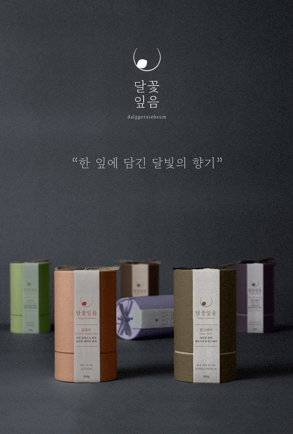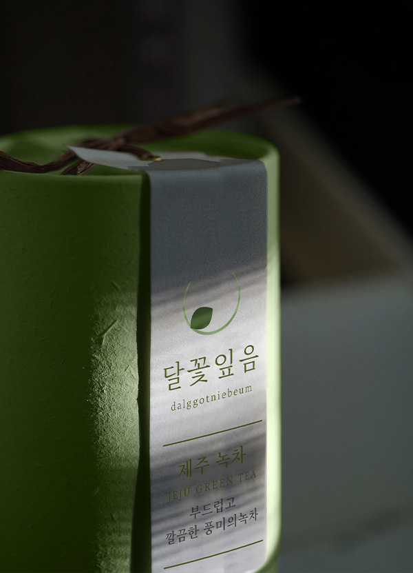
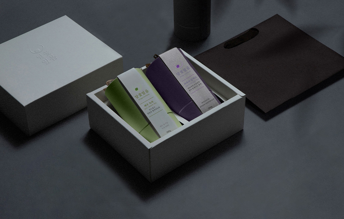
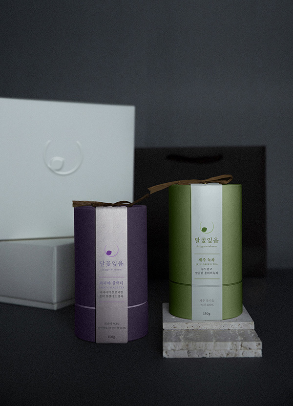
달꽃잎음
순우리말로 ‘달빛’을 의미하는 ‘달’과 ‘꽃잎’을 합성하여 고급스럽고 감성적인 찻잎 브랜드 이미지를 담았습니다.
차를 마시는 것은 일상의 쉼을 가지며, 나를 이끌어내고 세상을 따뜻하게 바라보는 것에 관한 일입니다.
“차 한 잎에 담긴 달빛의 향기” 라는 슬로건 처럼 소비자로 하여금 편안하고 향기로운 브랜드에 대한 이미지를 각인하기위하여 노력하였습니다.
It combines ‘Moon’, which means ‘Moonlight’ in pure Korean, and ‘Petal’ to capture a luxurious and emotional tea leaf brand image.
Drinking tea is about having a daily rest, bringing me out and looking at the world warmly.
Like the slogan “Scent of Moonlight in a Tea Leaf,” we tried to imprint the image of a comfortable and fragrant brand on consumers.

달꽃잎음 IDENTIY
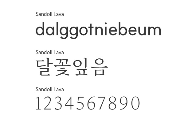
네이밍에서부터 느껴지는 감각적인 느낌과 젊고 세련되면서도 편안한 포지셔닝에 적합한 심플한 쉐입을 연출했습니다.
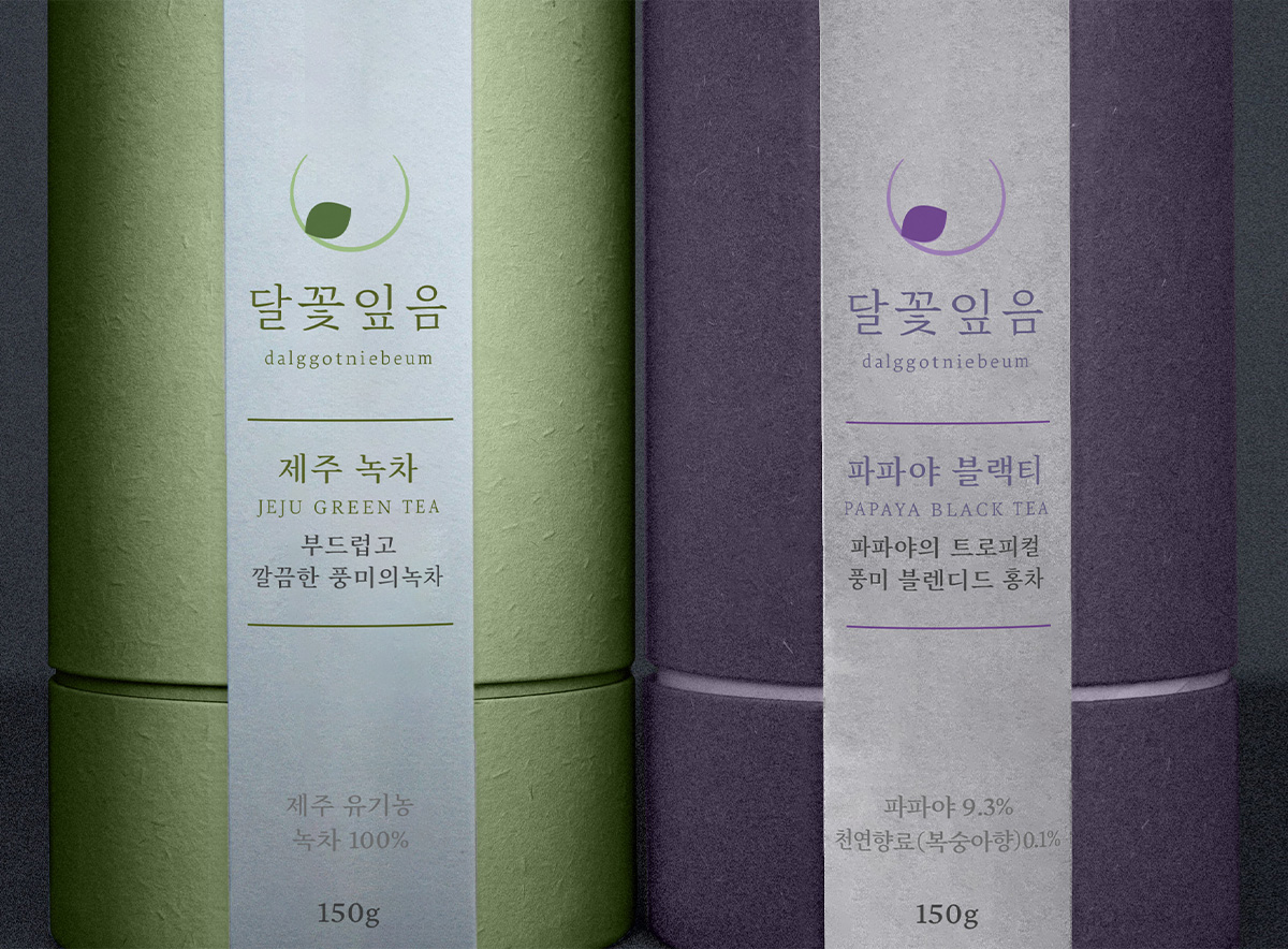
달과 꽃잎의 미니멀한 조합으로 브랜드의 네이밍과 분위기를 풍길 수 있도록 하였습니다.
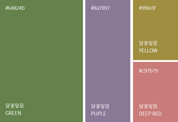
또한 브랜드 핵심가치를 시각적으로 표현하는데에 그치지 않고 촉각적으로도 느껴지는 컬러 시그널 인터렉션과 각 제품의 이미지를 상징하는 컬러로 “달꽃잎음”의 브랜드를 효과적으로 소비자에게 전달합니다.
It creates a simple shape that is suitable for young, sophisticated, and comfortable positioning with a sensuous feeling from the name.
The minimal combination of the moon and petals allows the brand to be named and atmosphere.
In addition to visually expressing the core values of the brand, it effectively delivers the brand of “dalggotniebeum” to consumers with color signal interactions that feel tactile and colors that symbolize the image of each product.