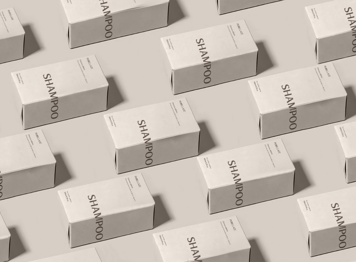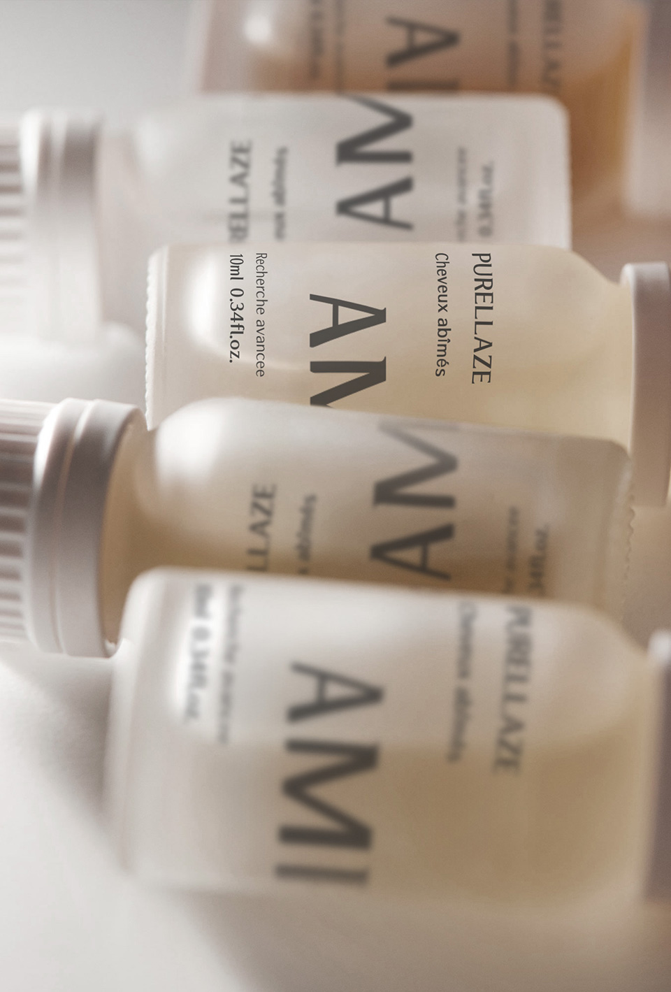
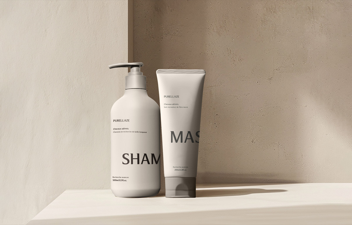
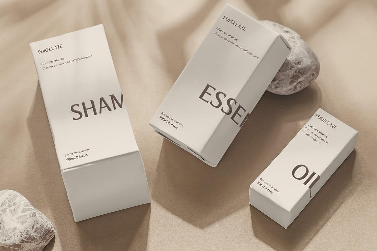
PURELLAZE
Pure(맑고 깨끗한) + l(럭셔리 이미지를 더한 알파벳) + aze(Alleviate의 일부를 사용하여 두피를 진정시켜주는 효과를 강조).
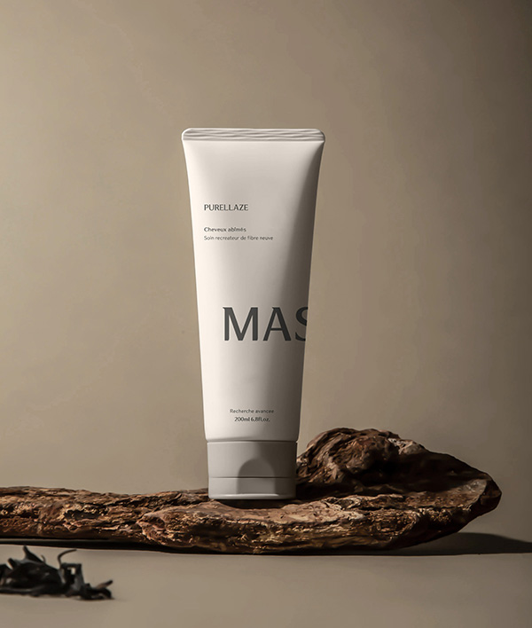
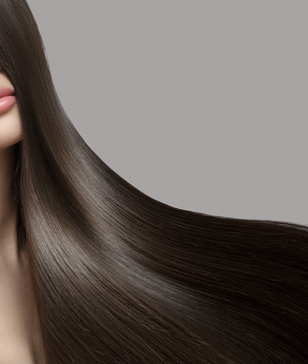
맑고 깨끗하며 고급스러운 이미지를 주는 헤어 케어 브랜드.
Pure (clean and clean) + l (alphabet with luxury images) + aze (emphasizing the calming effect of scalp using part of Alleviate).
A hair care brand that gives a clear, clean, and luxurious image.
PURELLAZE IDENTIY
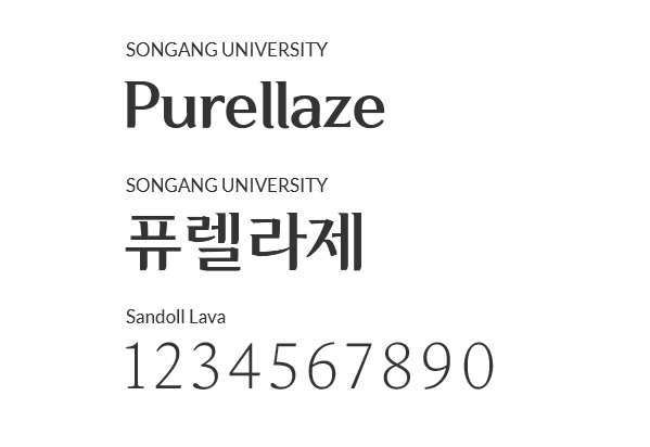
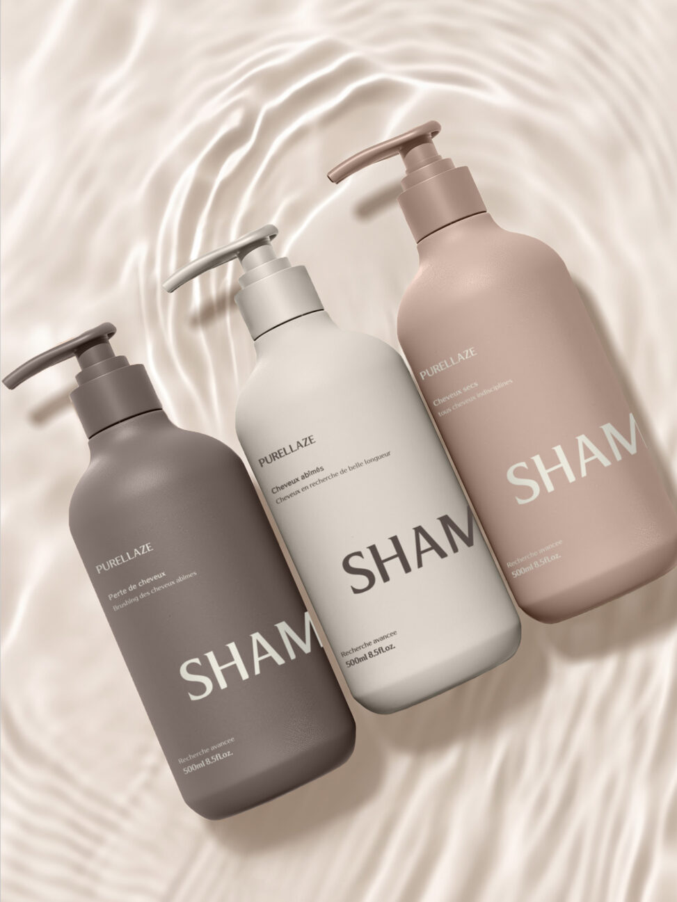
네이밍에서부터 느껴지는 감각적인 느낌과 깨끗하면서도 고급스러운 포지셔닝에 적합한 폰트로 연출했습니다.
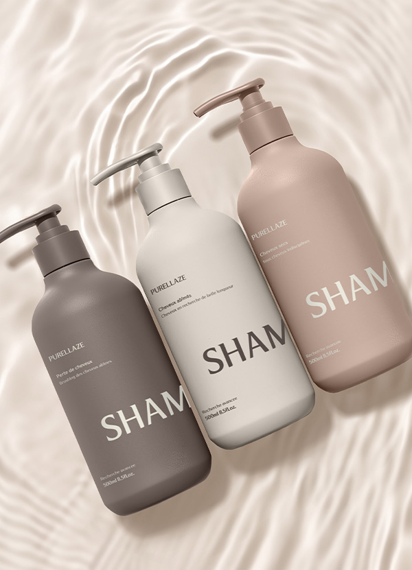
PURE + L(luxury) + AZE(Alleviate)의 조합으로 Purellaze의 브랜드 아이덴티티를 모두 표현하고있는 BI를 체택하였습니다.
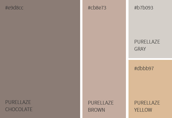
또한 브랜드 핵심가치를 시각적으로 표현하는데에 그치지 않고 촉각적으로도 느껴지는 컬러 시그널 인터렉션과 각 제품의 이미지를 상징하는 컬러로 “Purellaze”의 브랜드를 효과적으로 소비자에게 전달합니다.
It has a sensuous feeling from the name and a font suitable for clean yet luxurious positioning.
We chose BI, a combination of PURE + L (luxury) + AZE (allevation) to express all of Purellaze’s brand identity.
In addition, it not only expresses the core value of the brand visually, but also symbolizes color signal interaction that feels tactile and the image of each product Effectively delivering the brand of “Purellaze” to consumers in color.