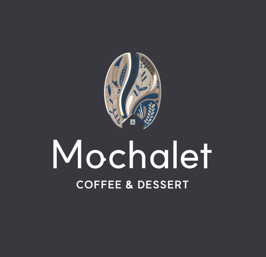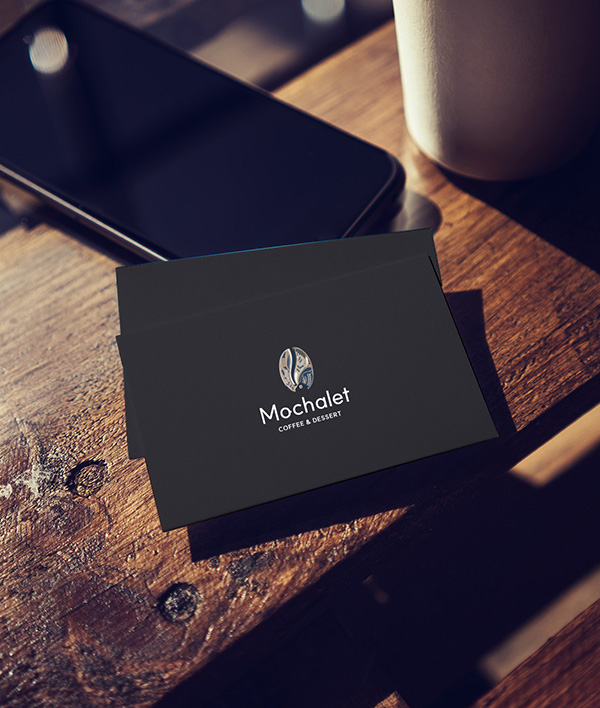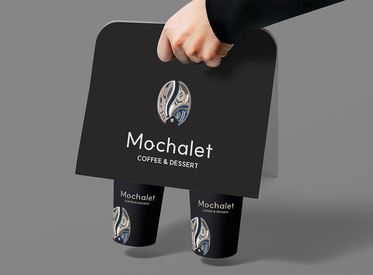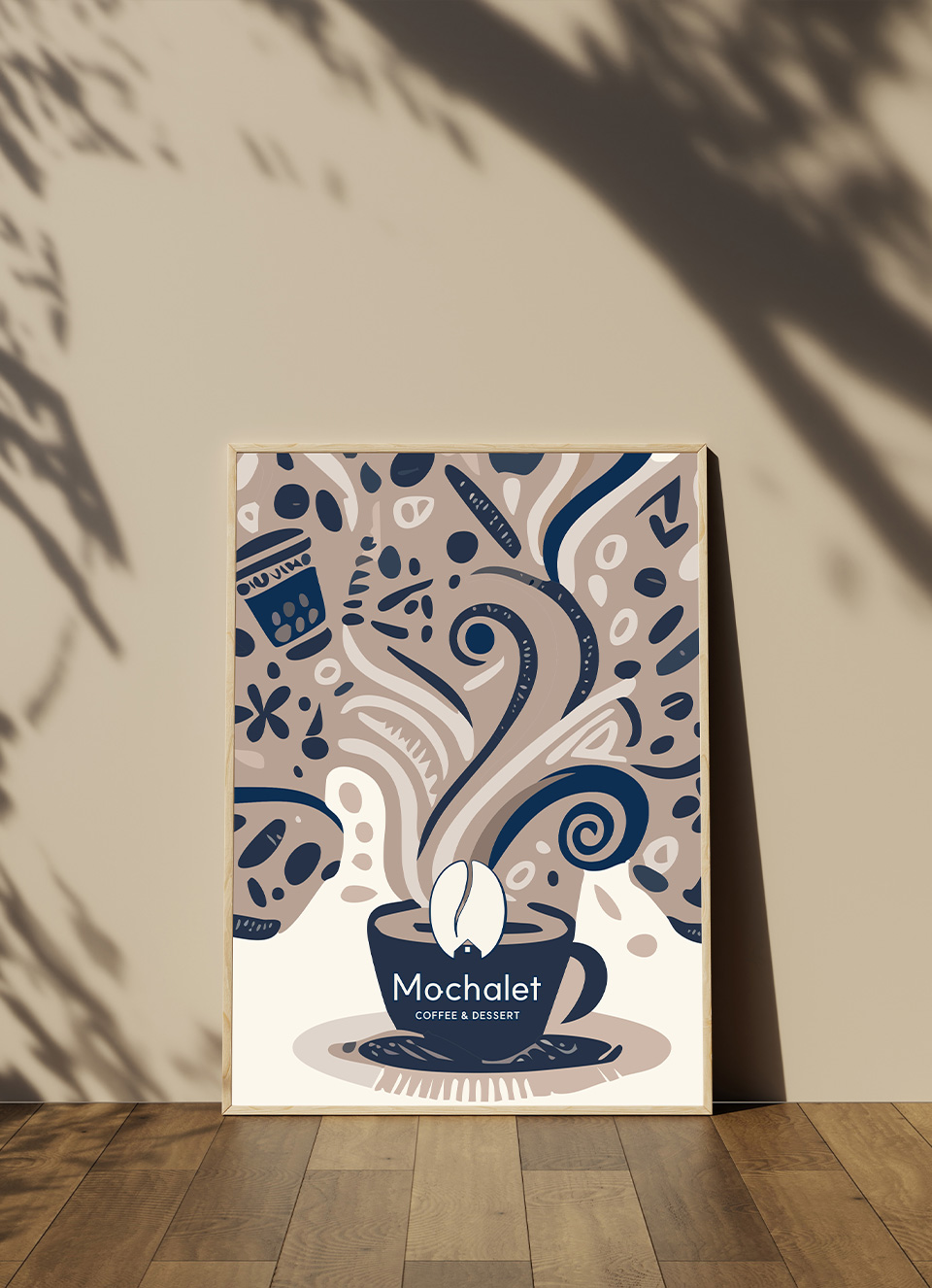
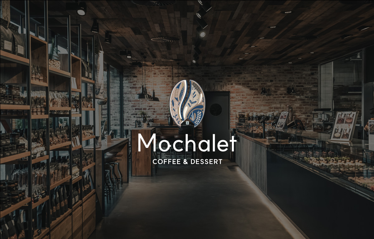
MOCHALET
‘모샬렛’이라는 이름은 초콜릿 언더톤이 들어간 커피의 일종을 뜻하는 ‘모카’와 산속에서 흔히 볼 수 있는 아늑한 오두막막을 뜻하는 프랑스어 ‘샬렛’의 합성어입니다.
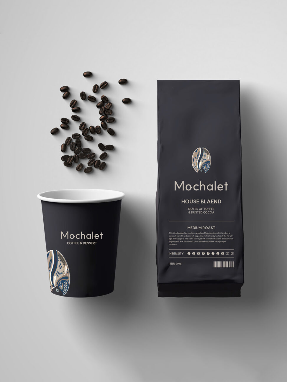
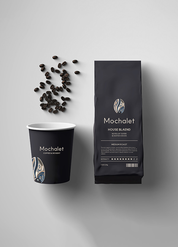
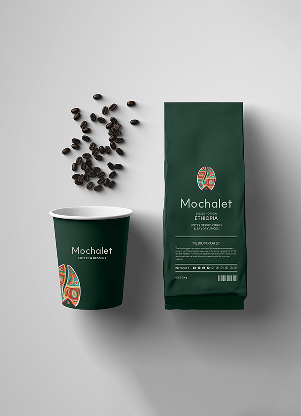
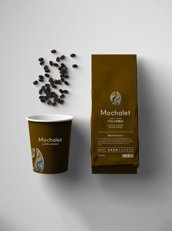
이 블렌드는 따뜻함과 편안함을 불러일으키는 현대적이고 고급스러운 커피 경험을 제안하며, 10~20세의 소비자에게 트렌디한 취향에 어필합니다. 모샬렛은 세련미와 캐주얼한 분위기를 모두 전달하며 젊은 층을 위한 테이크아웃 커피에 대한 브랜드의 집중도와도 잘 맞아떨어집니다.
The name “Mochalet” combines “Mocha,” a term that refers to a type of coffee with chocolate undertones, and “Chalet,” which is a French word meaning a cozy, wooden house often found in the mountains.
This blend suggests a modern, upscale coffee experience that evokes a sense of warmth and comfort, appealing to the trendy tastes of the 10-20 age demographic. The name conveys both sophistication and a casual vibe, aligning well with the brand’s focus on takeout coffee for a younger audience.
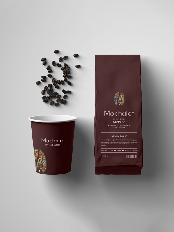
MOCHALET IDENTIY
네이밍에서부터 느껴지는 감각적인 느낌과 젊고 세련된 포지셔닝에 적합한 세련되고 심플한 쉐입을 연출했습니다.
심플한 쉐입에 제품의 특성이나 분위기에 맞는 패턴을 적용해 과도한 심플함을 보완하였으며 브랜드 핵심가치를 시각적으로 표현하는데에 그치지 않고 촉각적으로도 느껴지는 컬러 시그널 인터렉션과 밝으면서도 고급진 이미지를 상징하는 컬러로 루보의 브랜드를 효과적으로 소비자에게 전달합니다.
It creates a sophisticated and simple shape suitable for young and sophisticated positioning with a sensuous feel from the name.
It complements excessive simplicity by applying a pattern suitable for the characteristics or atmosphere of the product to a simple shape, and not only visually expresses the core values of the brand, but also effectively delivers Lubo’s brand to consumers with color signal interactions that feel tactile and colors that symbolize bright and luxurious images.