BELLEVUE IDENTITY
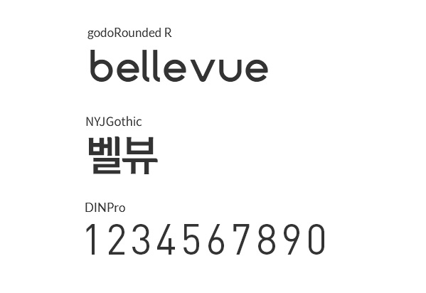
BELLEVUE의 로고는 따뜻함과 친근함을 발산하며, 매력적인 디자인으로 건강한 식생활의 본질을 구현합니다.
부드렵고 산뜻한 핑크톤을 사용하여 따뜻한 느낌을 주는 반면 장난기 있으면서도 현대적인 글꼴은 친근한 느낌을 더합니다.
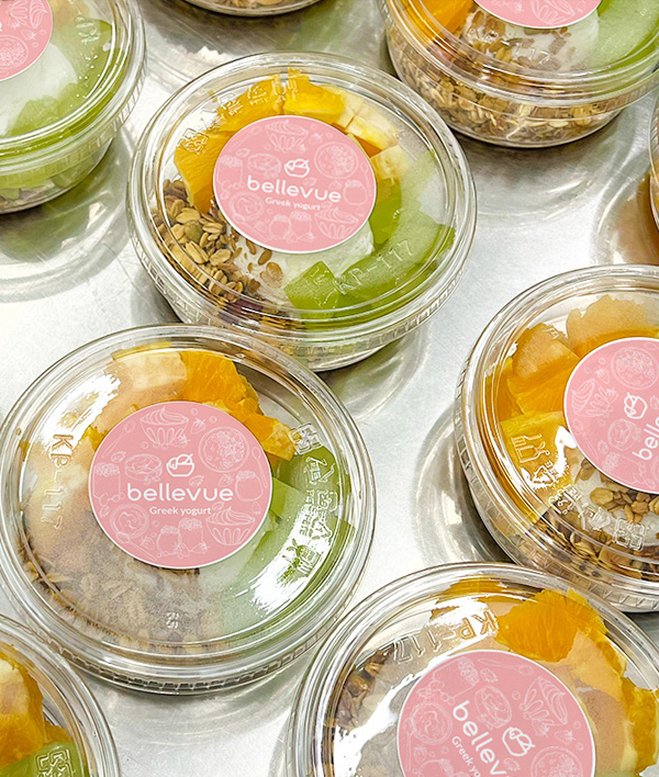
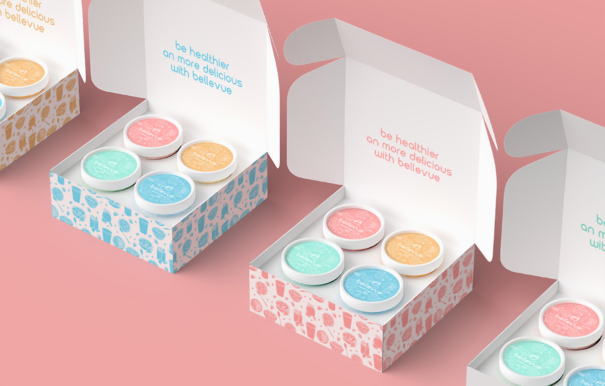
그릇아이콘은 건강한 한끼 식사라는 아이디어를 상징적으로 포착하여 건강과 맛을 하나의 즐거운 채키지로 추구하는 사람들에게 직접적으로 어필합니다.
영양가 있지만 가볍게 한끼를 즐기고자 하는 모든 사람들이 원하는 라이프스타일의 상징입니다.
This logo from [bellevue] exudes warmth and friendliness, and its attractive design embodies the essence of healthy eating.
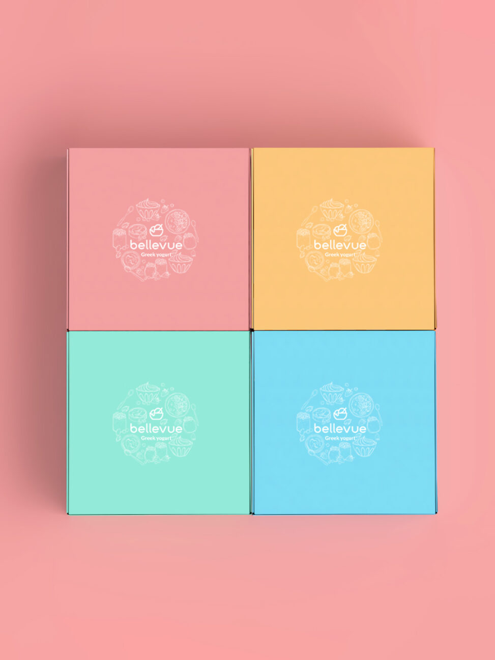
The puffy and fresh pink tone gives it a warm feel, while the playful yet modern font adds a friendly feel.
The bowl icon symbolically captures the idea of a healthy meal, appealing directly to those who seek health and taste as one joyous charcuterie. It is a symbol of the lifestyle that everyone who wants to enjoy a nutritious but light meal wants.

BELLEVUE IDENTITY
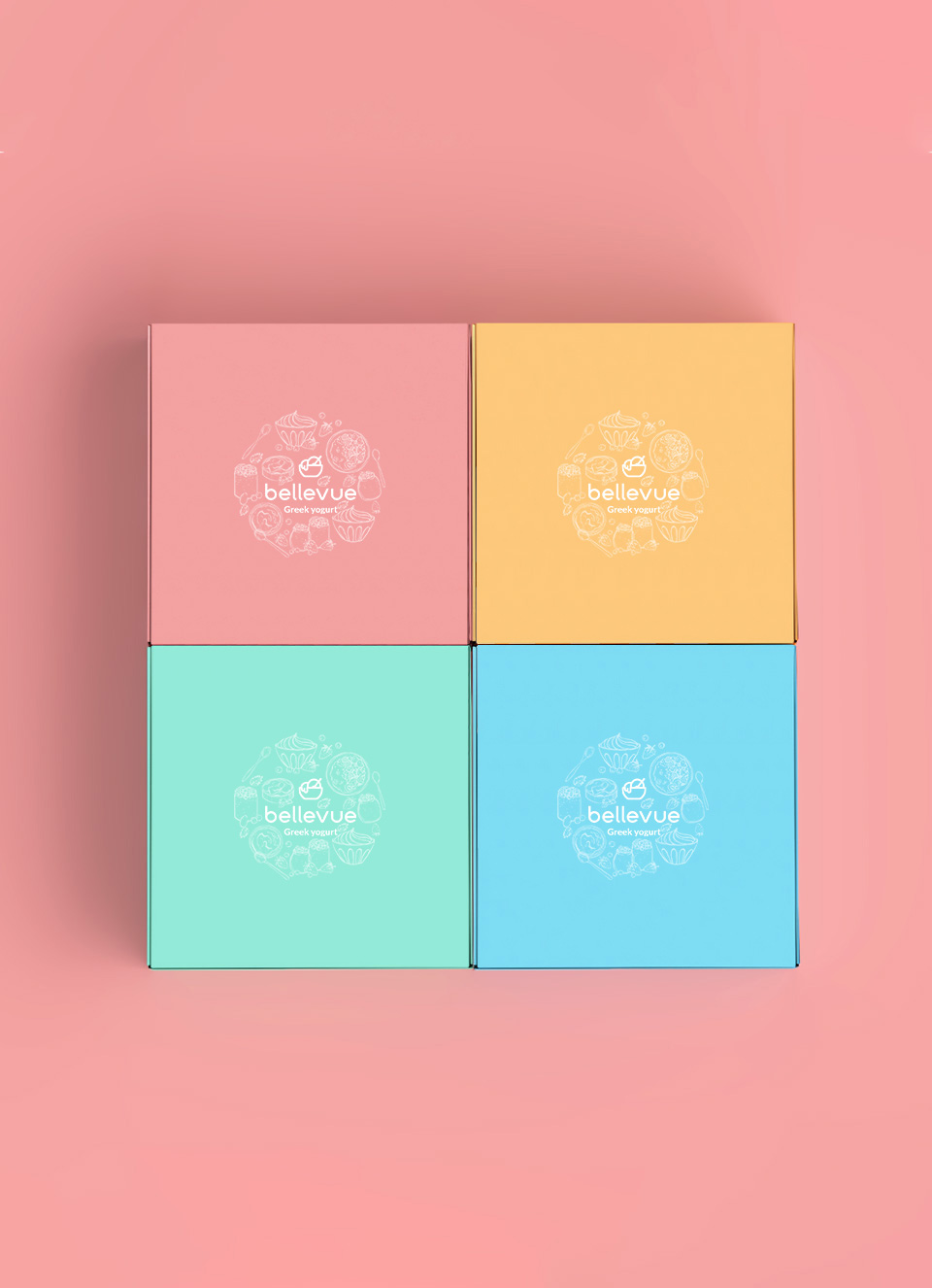
네이밍에서부터 느껴지는 감각적인 느낌과 젊고 세련된 포지셔닝에 적합한 세련되고 밝은 브랜드 무드를 연출했습니다.
브랜드 핵심가치를 시각적으로 표현하는데에 그치지 않고 촉각적으로도 느껴지는 파스텔 컬러 시그널 인터렉션과 밝으면서도 귀여움과 고급스러움을 동시에 나타낼 수 있는 이미지를 상징하는 컬러로 벨뷰의 브랜드를 효과적으로 소비자에게 전달합니다.
It created a sophisticated and bright brand mood suitable for young and sophisticated positioning with a sensuous feel from the name.
In addition to visually expressing the core values of the brand, it effectively delivers the brand of “BELLEVUE” to consumers with pastel color signal interactions that are felt tactile and bright and symbolizing images that can express cuteness and luxury at the same time.