LUVO
루보는 ‘도움’ 또는 ‘도와준다’는 뜻의 라틴어 ‘루보’에서 유래했습니다.
이는 2030 세대를 겨냥한 건강 보조 식품에 초점을 맞춘 비즈니스가 건강한 라이프스타일에 대한 지지를 강조하는 것과 잘 맞아떨어집니다.
우리는 새로운 변화에 능동적이며, 적극적으로 자신의 삶을 찾아 나가는 모든 현대인들에게 옆에서 챙겨줄 수 있는 장기적인 파트너로써 완벽한 당신을 위해 홀라이프 서포트가 가능한 큐레이팅 브랜드를 구축하였습니다.
젊은 연령층의 브랜드의 타겟층을 고려하여 따뜻하고 친근한 톤앤매너, 트렌디한 디자인과 인터랙션을 사용해 기존의 건강기능식품과의 차별화를 보여줍니다.
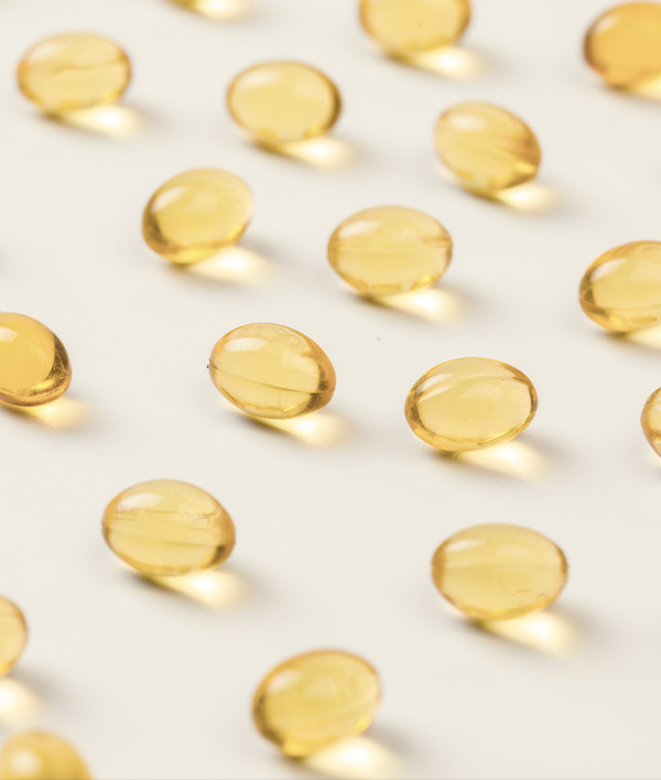
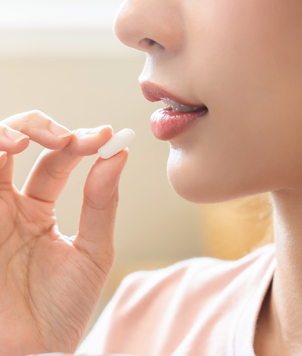
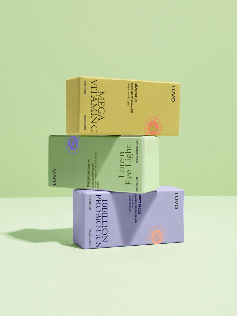
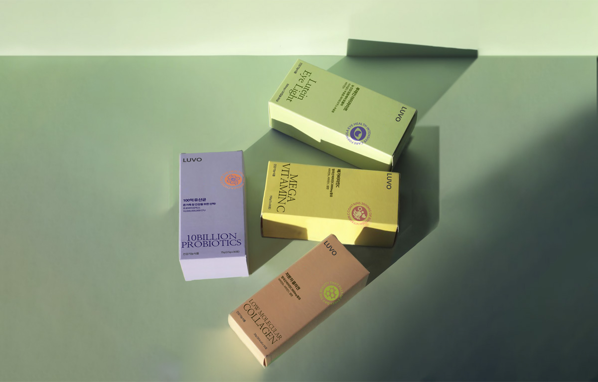
Agend is a health functional food brand that informs and prevents the dangers of AGEs and diseases through it. Renew existing brands and new ones We have developed a logo type, color, and key visual system to build our identity.
Due to the nature of the product, we focused on improving consumer awareness of existing health functional foods that give an outdated impression. To improve this, Agend wants to move forward. I wanted to convey an experimental image of the direction of doing and a visual image that emphasizes the expertise of health functional foods.
Functional and simple typography-type BI facilitates Agend’s brand image delivery. We have developed it to become a brand that not only young people but also elderly customers want to own by combining heavy and high-end colors while expressing reliable expertise as a functional health food with customer lifestyle through product efficacy.
LUVO IDENTITY
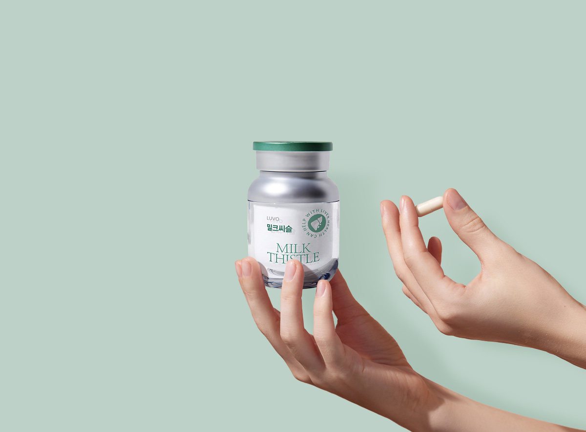
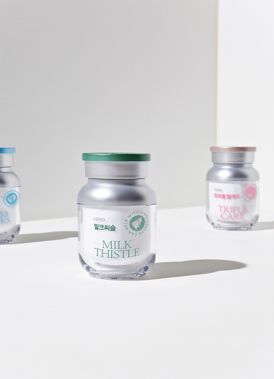
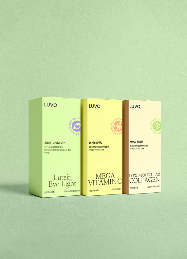
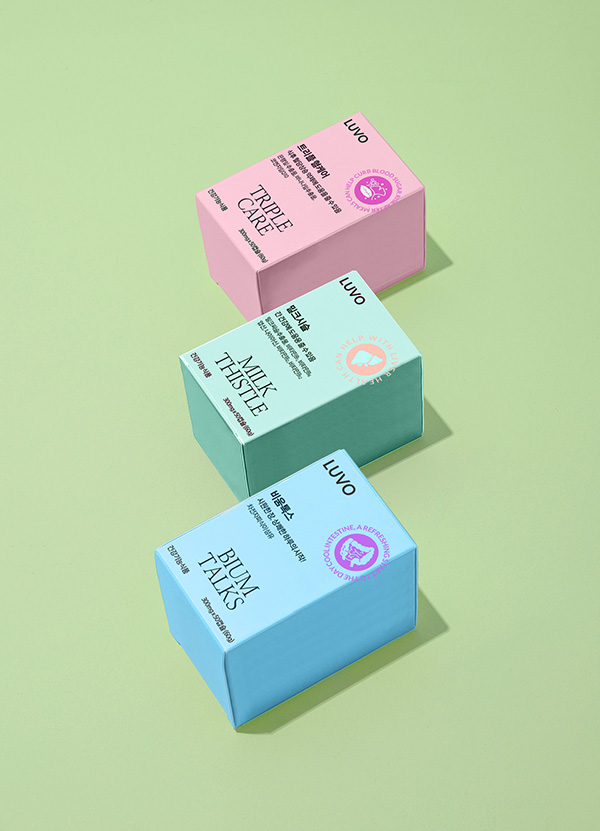
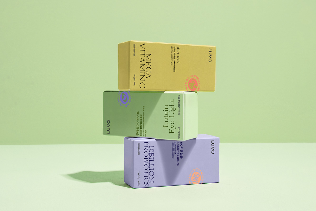
네이밍에서부터 느껴지는 감각적인 느낌과 젊고 세련된 포지셔닝에 적합한 세련되고 밝은 브랜드 무드를 연출했습니다.
브랜드 핵심가치를 시각적으로 표현하는데에 그치지 않고 촉각적으로도 느껴지는 파스텔 컬러 시그널 인터렉션과 밝으면서도 고급진 이미지를상징하는 컬러로 루보의 브랜드를 효과적으로 소비자에게 전달합니다.
It created a sophisticated and bright brand mood suitable for young and sophisticated positioning with a sensuous feel from the name.
In addition to visually expressing the brand’s core values, pastel color signal interactions that are felt tactile and bright and luxurious images It effectively delivers LUVO’s brand to consumers in symbolic colors.