LAP OF REAL PEPTIDE
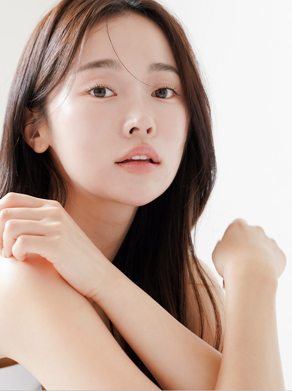
아름다움의 신뢰를 바탕으로 탄생한 코스메틱 브랜드 L.O.R.P가 2018년 첫 출시된 이후 지속적인 연구와 끊임없는 혁신을 통하여 2025년, 오늘날 더욱 진보된 4세대 L.O.R.P로 재탄생하였습니다. 브랜드의 메인 컨셉인 ‘역노화’의 키워드에 따라 디자인 측면에서도 건강하고 젊은 피부의 톤을 표현하기 위하여 군더더기없는 깨끗한 질감과 부드러운 색상으로 순하지만 청량한 느낌을 보여주었습니다. 모던한 레이아웃은 L.O.R.P의 기능성을 강조합니다.
The cosmetics brand L.O.R.P, which was founded on trust in beauty, was first launched in 2018 and is further developing in 2025 and today through continuous research and continuous innovation.
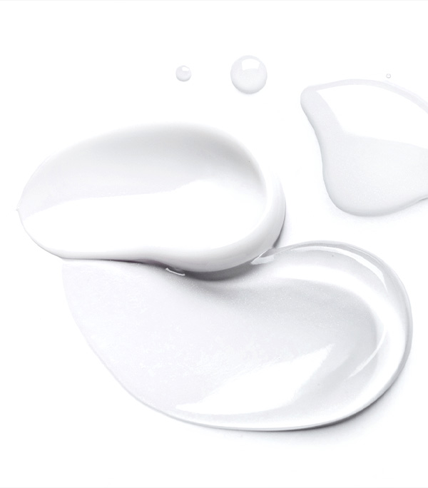
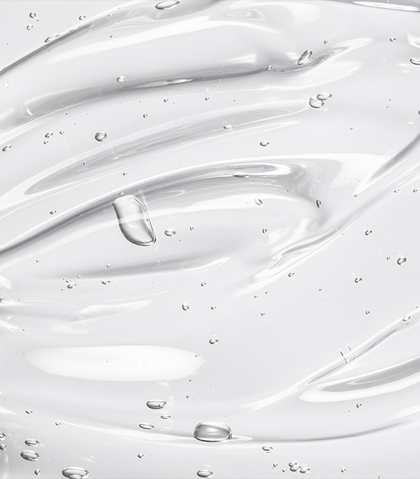
It has been reborn as the 4th generation L.O.R.P Following the keyword ‘reverse aging’, which is the main concept of the brand, healthy and youthful skin tone can be expressed in terms of design with a clean texture.
The soft colors give a gentle yet refreshing feel. The modern layout highlights the functionality of the L.O.R.P
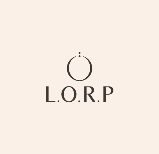
L.O.R.P IDENTITY
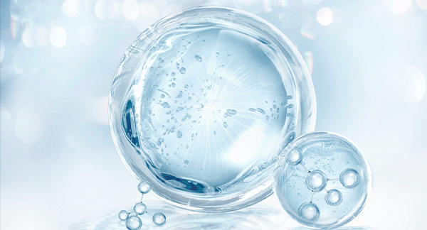
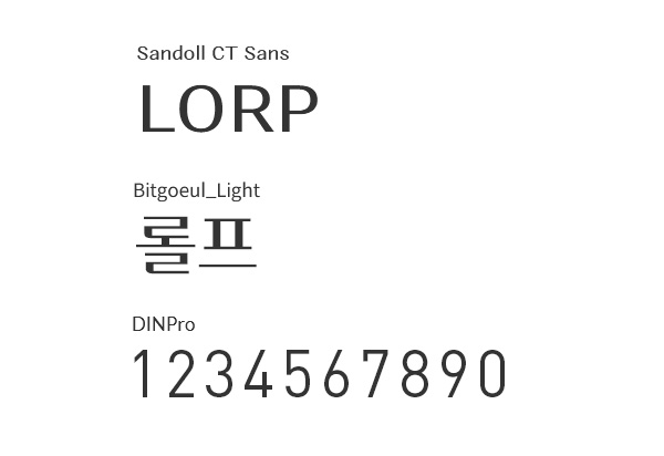
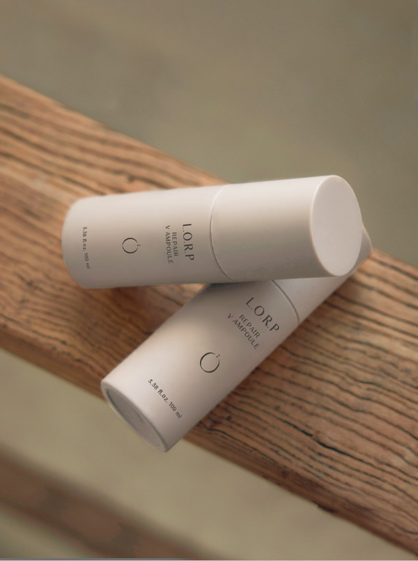
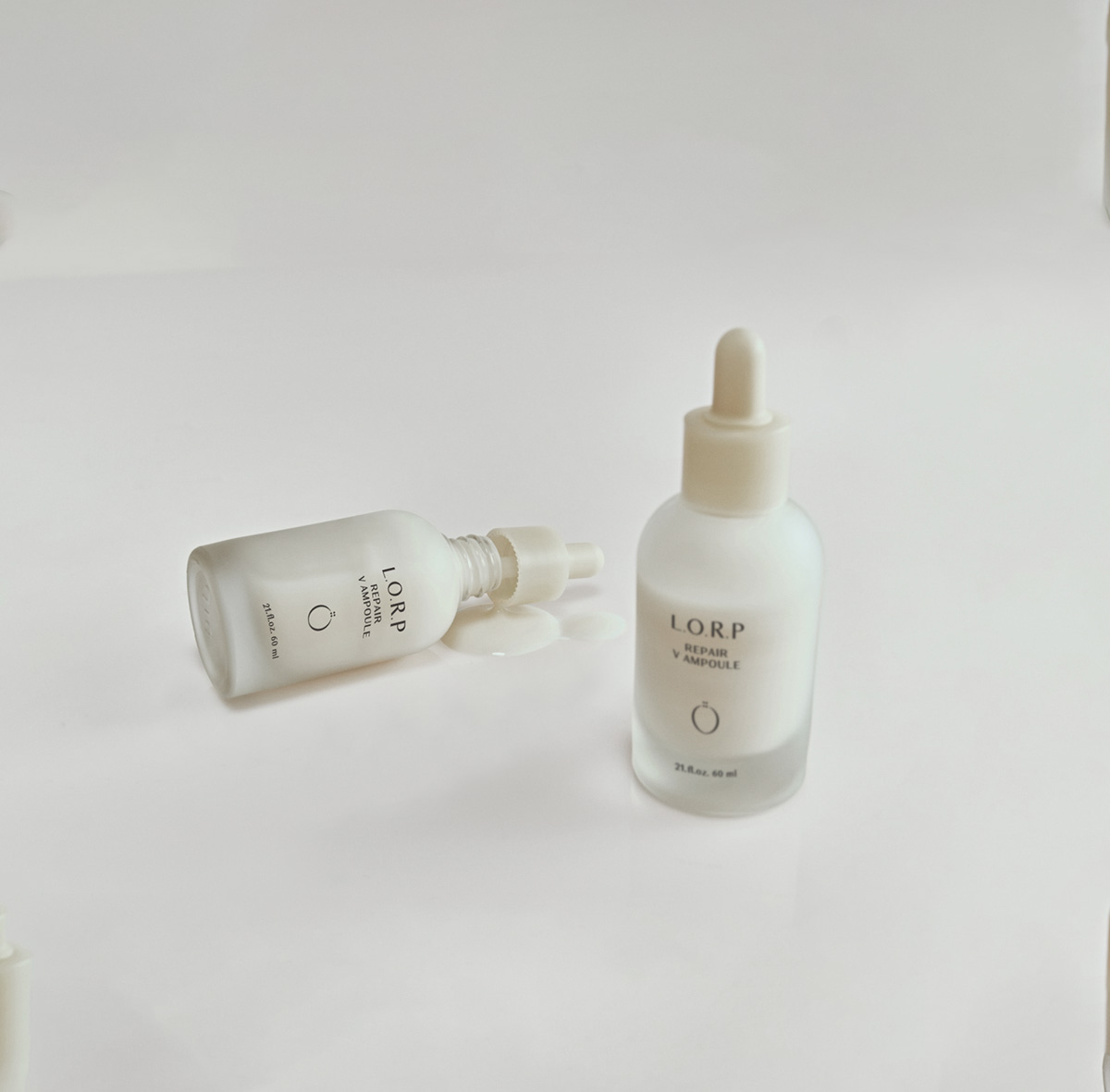
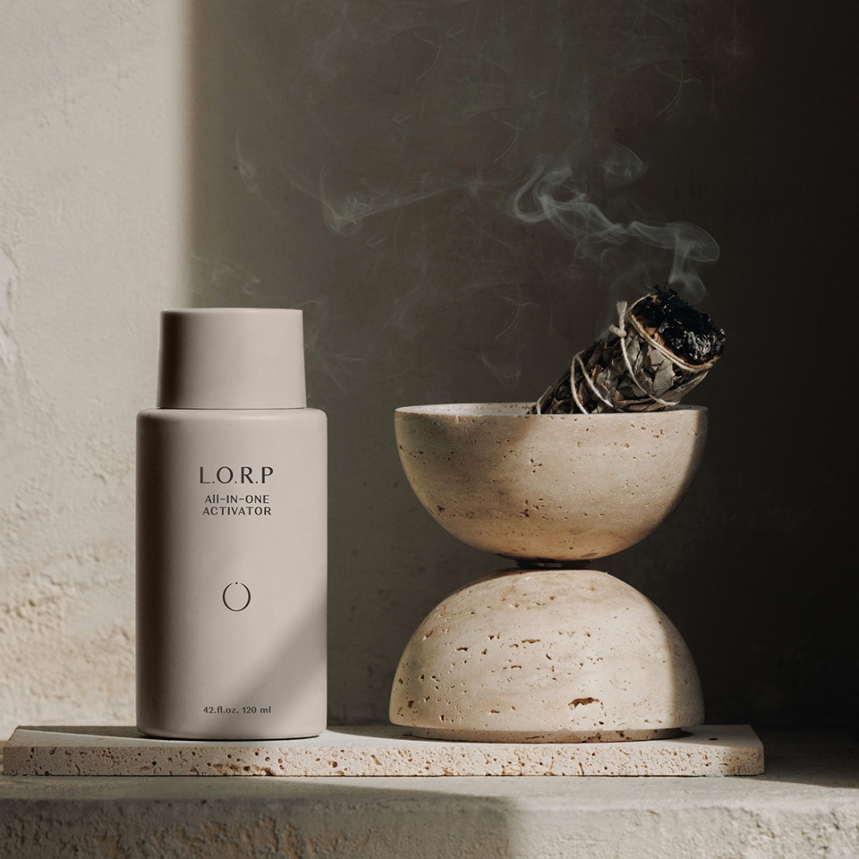
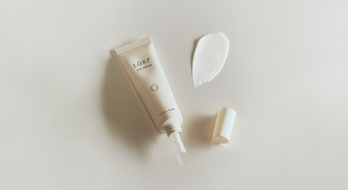
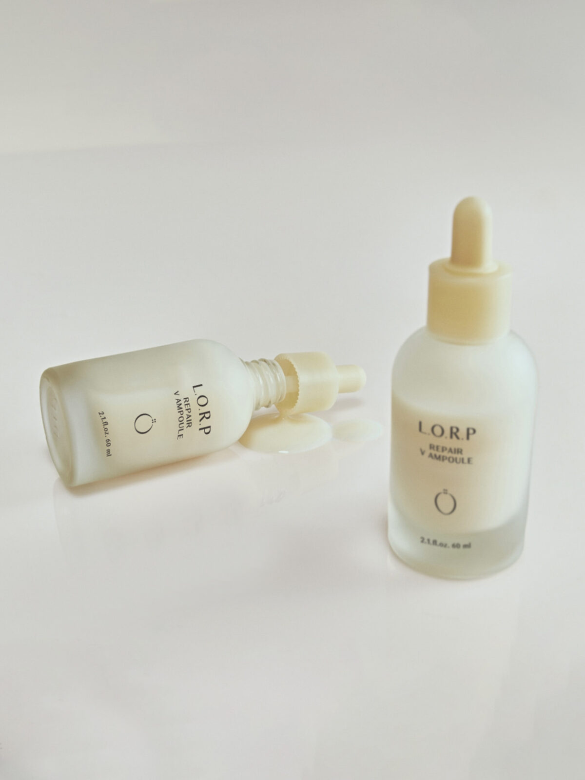
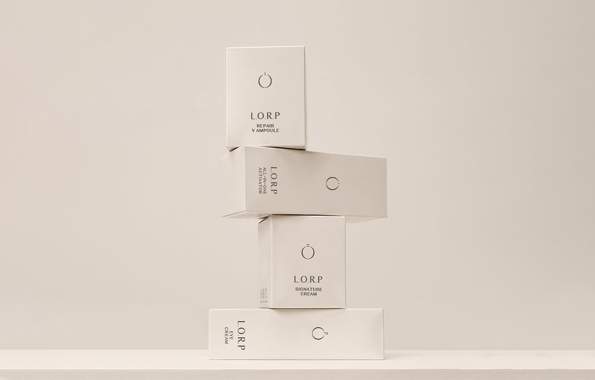
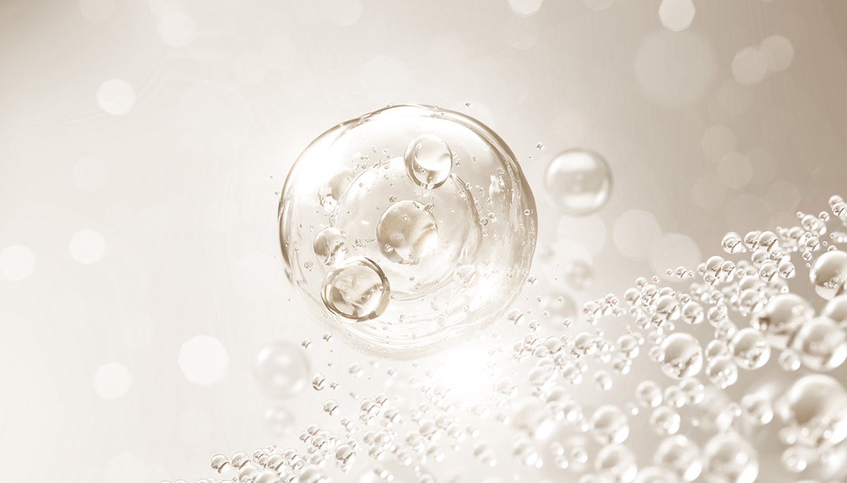
L.O.R.P의 BI는 세포에 스며드는 L.O.R.P PEPTIDE를 모던한 느낌으로 재 해석한 디자인으로 사용단계를 나타내는 기능성을 추가하여 탄생했습니다. 단상자 디자인에서도 제품의 마일드한 성분과 사용감 및 생기있고 잡티없는 피부톤을 시각적으로 전달하고자 옅고 파우더리한 색상과 질감을 사용하였습니다. L.O.R.P의 기본 가치인 기능성은 고유의 자산인 세련되고 대담한 레이아웃을 통해 표현하였습니다.
본질적이고 순한 느낌을 더욱 강조하고자 로고와 제품명 모두 후가공만으로 표현하여 지나치게 눈에 띄지 않게 디자인하였습니다.
BI of L.O.R.P is a modern re-interpretation of L.O.R.P PEPTIDE permeating cells, and it was created by adding functionality to indicate the stage of use. In the single box design, light and powdery colors and textures were used to visually convey the mild ingredients, feeling of use, and lively and blemish-free skin tone of the product. Functionality, the basic value of L.O.R.P was expressed through a sophisticated and bold layout that is a unique asset.
To further emphasize the essential and gentle feeling, both the logo and the product name were designed to be unnoticed by post-processing only.