Good & Health
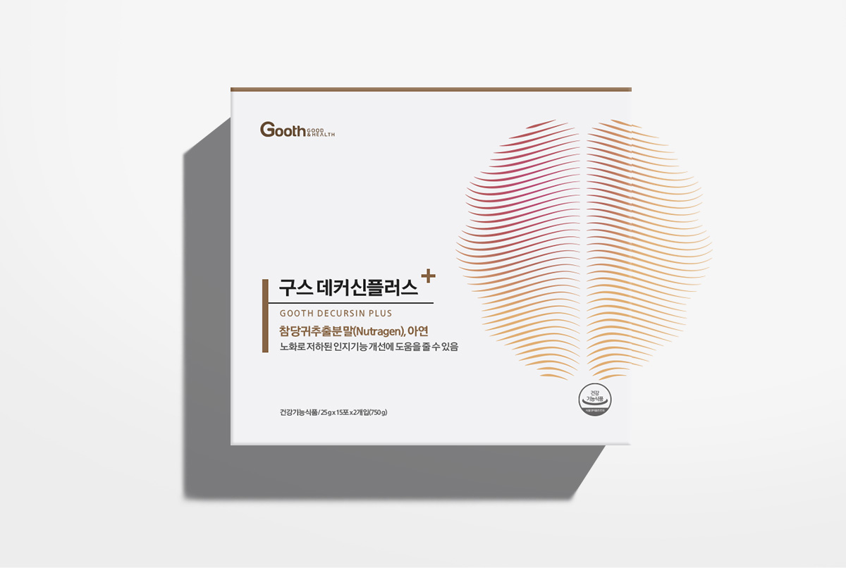
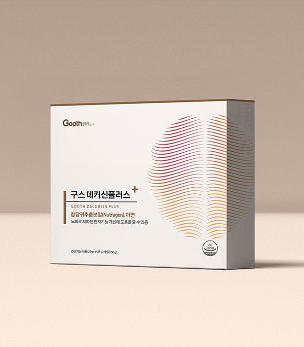
프리미엄 헬스케어 브랜드인 GOOTH의 PLUS라인을 위한 브랜드 아이덴티티 및 패키지 디자인을 개발했습니다.
GOOTH라는 네이밍은 Good & Health의 의미로, 유저의 건강을 책임지는 브랜드가 되겠다는 의지를 표현한 것입니다. 살아있다는 것은 세포가 끊임없이 활동한다는 것을 의미합니다.
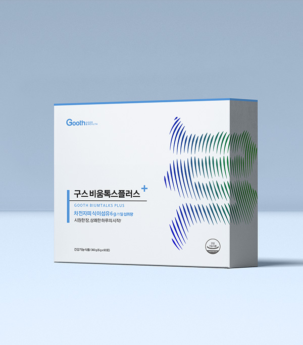
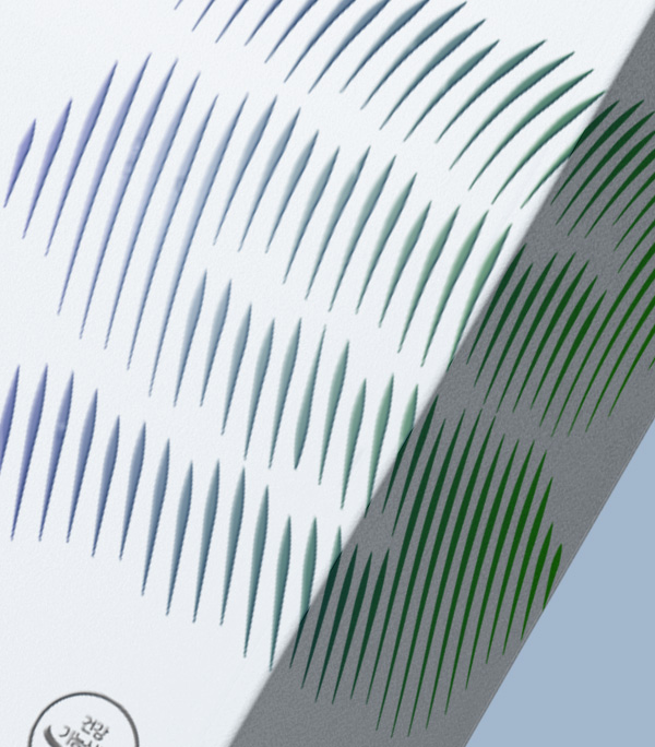
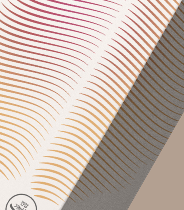
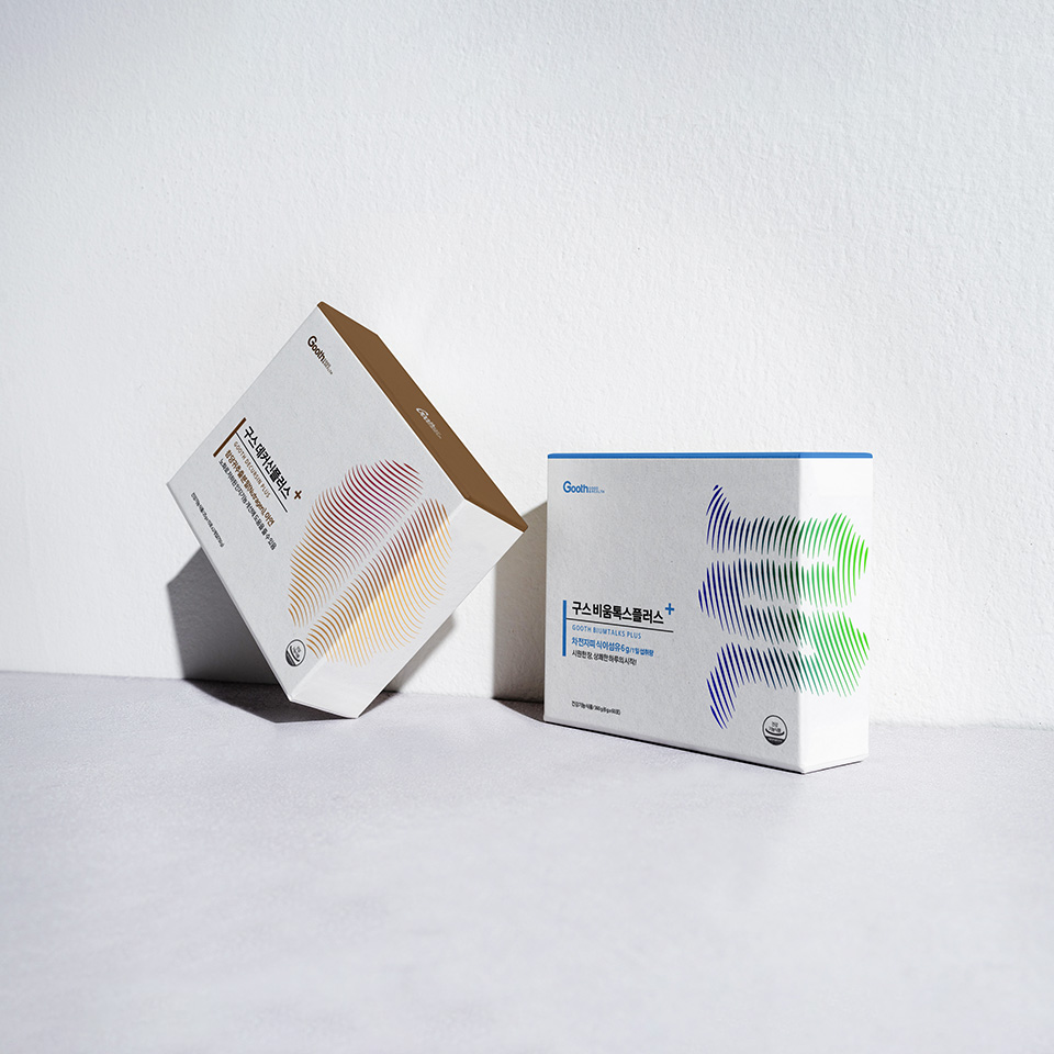
우리 건강 또한 안정된 상태를 향한 항상성을 추구합니다. 건강의 균형을 맞추기 위해 활동을 멈추지 않는 몸 속 세포와 장기의 모습은 GOOTH PLUS의 주요 디자인 컨셉의 모티브가 되었습니다.
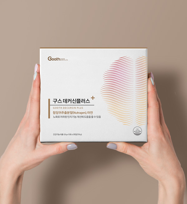
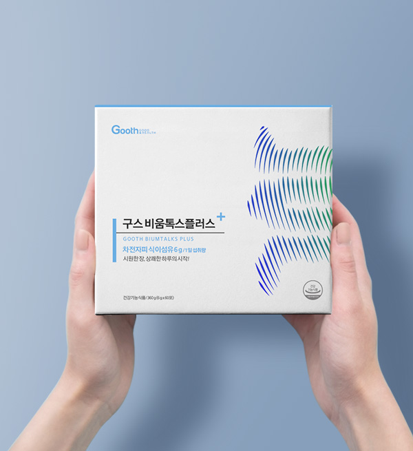
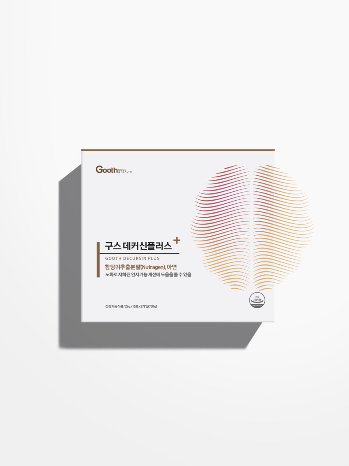
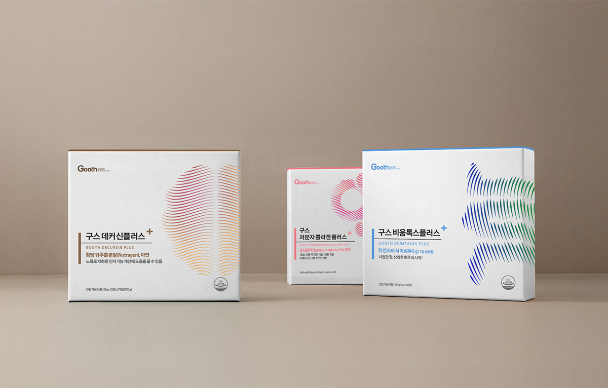
완벽함은 도달하는 것이 아니라 탐험하는 것이라고 믿습니다. 제품별 픽토그램과 컬러를 패키지 디자인 전반에 걸쳐 적용해 브랜드 아이덴티티를 표현했습니다. GOOTH의 정교한 기술력을 상징하는 웨이브 픽토그램과 컬러를 프레스티지 라인에 사용해 첨단 럭셔리의 이미지를 전달합니다.
Developed a brand identity and package design for the PLUS line of GOOTH, a premium healthcare brand.
The name “GOOTH” means “Good & Health,” which is an expression of the company’s commitment to become a brand responsible for its users’ health. Being alive means that the cells are constantly active.
Our health also pursues homeostasis toward a stable state. The appearance of cells and intestines in the body that do not stop working to balance health is the main part of GOOTH PLUS It became the motif of the design concept. I believe perfection is about exploring, not reaching.
I believe perfection is about exploring, not reaching. The brand identity is expressed by applying product-specific pictograms and colors throughout the package design. Wave pictograms and colors, which symbolize GOOTH’s sophisticated technology, are used in the prestige line to deliver an image of advanced luxury.